
The New "In" Colors for the New Year
8th Jan 2016
Pantone, the authority on color, has unveiled an official “color of the year” for each of the past 16 years.
This “color of the year” — often controversial and always talked about — has set trends in design for many different industries, from fashion to flowers, since 2000.
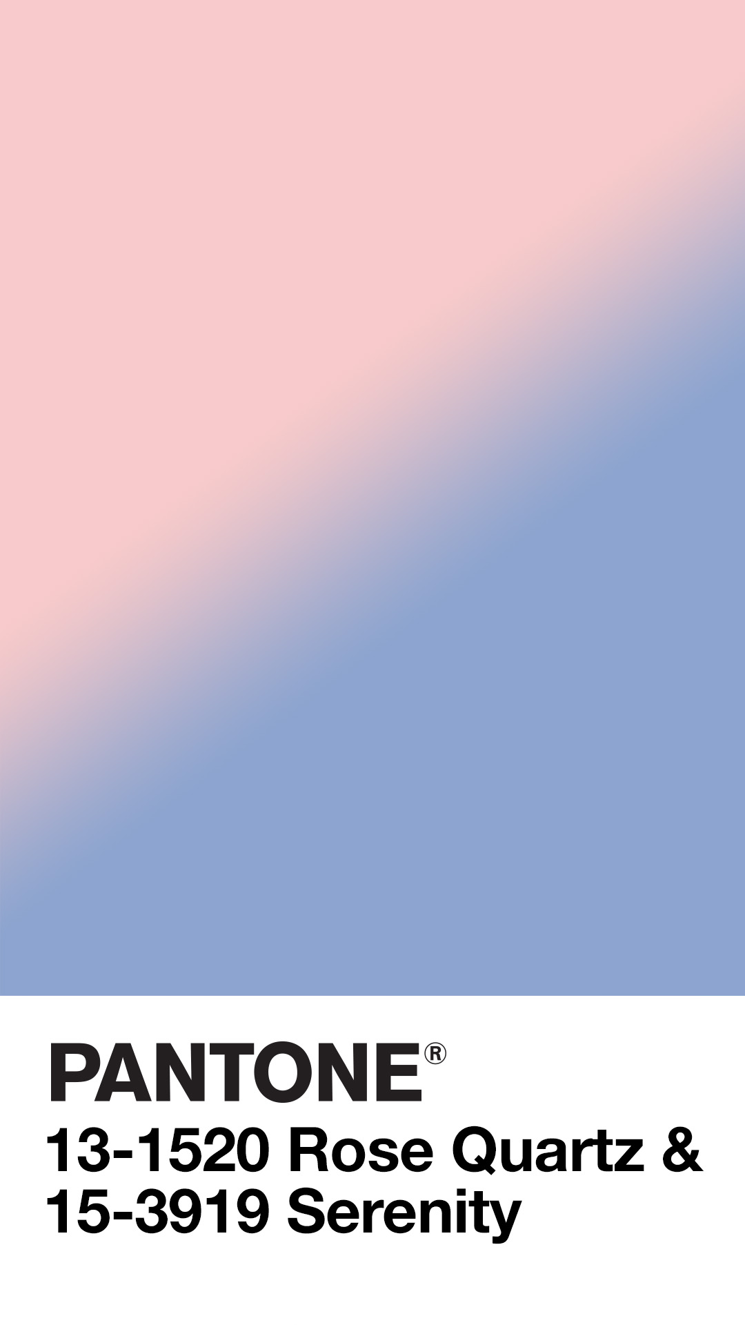
In 2016, however, Pantone couldn’t decide on a single color, so they chose two: Rose Quartz and Serenity. These ‘warm pink’ and ‘tranquil blue’ colors are a stark departure from the darker and more vibrant colors of the past few years, and that’s for a specific purpose.
While Pantone’s annual “color of the year” selection might not be an exact science, there is a great deal of thought and ideology that goes along with the symbolic color (or colors). Pantone says it selected these two particular colors to represent a sense of balance and peace, citing the fact we seek mindfulness and well-being as an antidote to modern day stresses.

According to Pantone, the combination of Serenity and Rose Quartz also challenges traditional perceptions of color association and coincides with societal movements toward gender equality and fluidity. They noted that a new generation that has less concern about being typecast or judged has opened our eyes to different approaches of color usage.
Pantone chose the pink and blue combination to shake up gender norms when it comes to design.
"In many parts of the world we are experiencing a gender blur as it relates to fashion, which has in turn impacted color trends throughout all other areas of design," Leatrice Eiseman, executive director of the Pantone Color Institute, said in a statement.
While the soft color combination may bring baby showers to mind for many, the colors are sure to pop up soon in other areas of fashion and home décor — like floral design — where the pastel colors and watercolor hues have rapidly grown in popularity.
 Pink and Blue - Not for You?
If you aren’t on board with Pantone’s color(s) of the year for 2016, never fear! You can still be on the cutting edge of fashion and design by simply choosing another source for your inspiration. For the past few years, paint giant Benjamin-Moore has selected their own colors unrelated to Pantone.
Their “color of the year” choice for 2016? “Simply White,” complete with the suggestion to “surrender to the complexity of white.”
Whether you buy into the Pantone selection, the Benjamin-Moore selection, or perhaps prefer your own personal “color of the year” choice, Soderberg's Floral & Gift can help you find the perfect bouquet of flowers to help you start off the new year with a touch of beauty for your home or office! Give us a call at (612) 724-3606 or stop in to see what we have in store for 2016. Happy New Year from your friends at Soderberg's!